Gordon Goodwin's Big Phat Band

Boldly Fine Makes it Phat
What do you get when you take Los Angeles’ top-tier/first-call/”A-lister” studio musicians, a bandleader who composes scores for Hollywood’s most iconic films and TV shows, and a combined love for jazz?
The Phat Band. You get The Phat Band.
Keep scrolling to see the much-needed website redesign we worked on with Gordon and his amazing band.

Before
When we met Gordon, he was stuck using an outdated, non-responsive, dated Wordpress theme which was really difficult to maintain.
Holy early 2000’s, Batman!

After
That nasty Wordpress site simply wouldn’t do for a band of this caliber, so we redesigned the site from scratch with one goal - make it PHAT.
We leveraged the latest, greatest features of Squarespace 7.1, including the new Fluid Engine to produce an ultra-bold, interactive site full of personality. This band is anything BUT bland, so the design had to visually emphasize the same “phatness” heard when these guys play.

Brand identity is everything
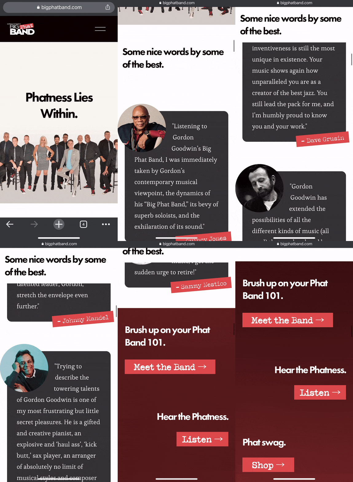
It is essential to maintain brand identity when completely redesigning an established website. To pull this off, and to actually emphasize the branding throughout the new site experience, we took inspiration from the original logo and implemented elements of the logo throughout the site.
The tilted “Phat” part of the logo appears throughout the site as a highlighted state to draw the eye to important selected states. The actual monospaced font in the logo is used throughout the site as a tertiary, complimentary typeface. The color palette is a simple three-color palette pulled directly from the logo.

Don't be lazy, give your users deep links
For musicians and bands, the ability for fans to listen to their music is obviously one of the most important features their website needs. And with today’s competitive landscape of streaming apps, it is imperative to provide deep links (opens up the artist’s page in the actual app, rather than the crummy web version) for every major streaming platform. This provides fans with a user experience they expect when they click that icon, and gives them the ability to listen right away 🎧
BTW, have you heard these guys play? Seriously, you gotta hear it to believe it 🤯

custom code is kind of our thing 🤓
The experience you see here is a design which was custom tailored and developed for this particular part of the page. Gordon wanted to show some high praise of his band from these titans of the music industry, but Squarespace doesn’t have this “sticky scroll” feature or that cool custom quote component with the circular photos.
Most Squarespace agencies and designers have to stop here, since this isn’t “easy” to do for your everyday Squarespace designer. But if you know what you’re doing (*cough* us *cough*), this kind of thing is no problem.
We have a top-notch development team who know JavaScript/CSS/HTML like the back of their hand and can create literally any experience you can imagine - yes, even on Squarespace.

Phatness favors the bold
Enough said, let the site do the talking.
